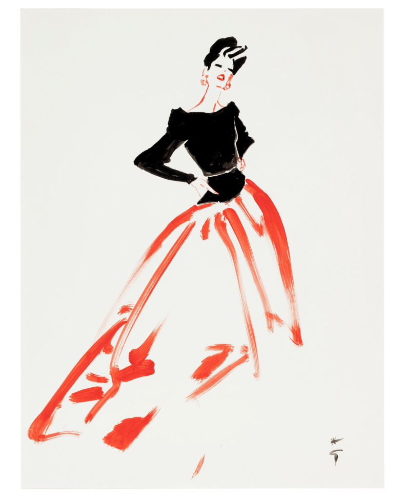
Cake & Couture: S Curve Composition
"Draw an S from the head, through the hips, to the floor…" my fashion illustration professor told us during a live model drawing session. The model quickly changed position every 10-15 seconds, just enough for us to loosen up and capture the essence of the pose. Wait, wait, just one more second! I'd think as she turned away from me. Page after page, I began again with the S curve in mind - exaggeration was encouraged! (I wish I had my sketch books with me here on Maui to show you! Plenty went to the recycling bin let me tell you!) It wasn't about perfection or the details but rather capturing the emotion, stature, and movement in single fluid lines. The letter S, in fashion illustration, was the standard guideline taught to present our sketches and designs. The "ideal" line - smooth, fluid, evoking effortless movement. It draws our eyes from top to bottom and back again in a harmonic flow, simultaneously accentuating the natural human form and garment.
When I shooting, I had little understanding of composition or how to create movement within a frame. Those illustration lessons resurfaced as I played and practiced with my camera until it just clicked…ah, ha! The principle is exactly the same! Quite often, I literally traced with my finger an "S" over the table or my subject, directing where I wanted the viewer's eye to travel. (Generally speaking, physically using your finger to compose movement around your subject(s)/props is a great place to start if you're not sure where to begin.) In essence, the S curve creates movement within the frame from one focal point, passing through or around another, to a final focal point…and back again. Think of a brook snaking through a valley between two mountains. Your eye naturally follows the bends and curves to the final point on the horizon and travels back down again…or the tilt of a hat, curve of the hips, and a sleek silk skirt…In food or lifestyle photography, this composition works particularly well with overhead tablescapes and 3/4 angles.
Before styling all the elements on your table or surface, try tracing with your finger or eyes where you want to direct the viewer's eye. Perhaps it's from a side dish, around the main dish, and another small plate…There are many ways (and letters!) that add dynamic movement within a frame through styling, and the S curve is just one I use most often. It's easier to demonstrate with photo references than words…these photos below illustrate the S composition.
I hope you incorporate this composition style into one of your next captures!


