The Real Reasons Why Your Photos Look Flat
We’ve all been there. You get home, so excited to check out your photos, certain there are a few gems on the card, only to upload them and feel that sinking feeling.
They just look…flat.
Dull.
Lackluster.
Maybe even boring?
It’s disappointing, especially when you felt the beauty in the moment. But I want to gently remind you: this happens to every photographer, and it isn’t so much as you doing something wrong, but maybe a misreading of the situation or poor circumstances that are out of your control. A flat photo isn’t a failure, it’s simply a clue. A moment to pause, observe, and ask what was missing.
Here are a few reasons your photos might be falling flat and what you can try next time, right there in the moment. Fair warning: I’m sharing a few of my own terrible photos to illustrate the point! (Not good, I know, but hey, we all take bad photos sometimes!) But I think seeing these examples will help the concepts click. Also, note that I edited these with my standard presets I usually use.
Little Contrast
Contrast adds dimension, drama, and a three-dimensional feel. Without it, a photo can feel lifeless, one-note, or muddy, especially when mid-tones dominate the scene. It’s not really my aesthetic to go overboard with contrast (though if that’s your thing, go all in!), but I do think it adds something visually intriguing. Even subtle shifts between highlights and shadows can bring an image to life. I do love it when shadows trail off softly or when there's a hint of that chiaroscuro drama; it can be beautiful and emotive, but it’s not always the look I’m going for. It really depends on the mood and intention behind the frame.
This doesn’t mean you always need harsh light or deep shadows; color contrast can be just as powerful and visually interesting. But if everything blends together too seamlessly, your subject might not have a chance to stand out to the viewer.
Next time: Look for natural contrast, bright areas against shadows, soft against rough, warm against cool. Move your subject or yourself to create some more directional light if the lighting is a bit flat or diffused. Maybe that is you moving under the shade to shoot into the light or positioning your subject to be more backlit or side lit. You can also use exposure compensation to deepen shadows or pull out highlights in-camera.
These photos are dull and just rubbish in my opinion. There isn’t much contrast, and the light is just one note. Also, just to note that I used my standard presets for all of these examples, and still, they feel and look flat because there is little contrast.

I was drawn to these beautiful trees lining the road, but while it was lovely in person, I don’t think it translates in camera because there is little contrast. I added a bit of contrast in Lightroom, but you can only add so much before it looks fake or overdone. Everything is just a bit too bland because of the light and the minor difference between highlights and shadows.

This was a gorgeous B&B I stayed in and loved the front entrance and thought it was an eye catching composition because of the symmetry and vines. But I think it just falls flat. There is little contrast, making it just looks dull and flat. A big part of why this looks flat is the diffused light and lack of contrast.

These lilacs initially caught my eye, but the photo feels a bit flat overall. The soft, diffused light creates a gentle mood, but it also reduces contrast, so the beautiful purple tones don’t quite stand out. I tried reducing the shadows and increasing contrast slightly, but it still feels somewhat one-dimensional. The lack of light variation is making it hard for the photo to really come to life.
Poor or Flat Lighting
Light is everything in photography. It’s our paint! When light isn’t working in your favor, a photo can look dull, even if the scene felt beautiful at the time. This is just one of those things that are out of our control. Unfortunately, we don’t have control over the sun or weather, and when the light isn’t cooperating as we hoped, our photo can fall flat, no matter how stunning the scene was or how well it was composed.
Flat lighting often happens when the light is too even, with no singular direction or intensity, like shooting in open shade or under midday cloud cover. Although diffused light can be full of life, if you fully embrace the softness, you can intentionally look for natural contrast in your frame. When shooting indoors, especially, I’m mindful of where the light is coming from…how many windows, doors, and other pockets of light there are. Knowing the direction of your light source and its intensity will help you decide where to position yourself or your subject.
When you're working with flat lighting, it can be tempting to feel like something’s missing. Flat light often lacks the contrast and directional shadows that create dimension, and as a result, subjects can appear lifeless. I’m not really of fan of frontal lighting (where the sun is behind you, lighting up your subject). There are scenarios it works, but I find that it literally flattens my image, almost compressing all the natural layers of my scene into one visual plane. But there can be a beauty to it, too. Instead of chasing depth through light, lean into softness. Let the mood and other elements in your frame take center stage. Focus on color, tonal harmony, emotions, shapes, patterns, and the textures in your frame. A soft, overcast day might not give you a punchy contrast, but it might provide you with something more ethereal, intimate, and soft.
Next time: Pay attention to the direction and intensity of light. Personally, I love side or backlighting because it naturally sculpts the scene and adds a three-dimensional quality. The light wraps around your subject literally, outlining the shape and texture, which creates a more three-dimensional, dynamic look and feel. If you can, use a reflector to bounce light back onto your subject; it can help lift the shadows and add some life to flat lighting. Alternatively, a darker reflector or even something like a black card can be used to subtly add shadows and bring back a bit of depth and dimension. If the light is diffused or feels a bit flat, try to create directional light by using your environment, whether you're indoors or out. Position your subject near a window, under an overhang, under a doorway, or beside a wall so that light is coming from ideally one side rather than all around. This helps create shape, depth, adds a bit of contrast, and a more three-dimensional feel in your photograph.
While the scenery is beautiful, the photos just don’t translate for me. The lighting is flat because in some its very diffused and light isn’t illuminating my main subject, like the cliff face and flowers.

A rugged, raw stretch of the Hawaiian coast, but to me, the image just falls flat. The light was heavily diffused, with the sky covered in a thick blanket of clouds, which made the entire scene feel dull and one-dimensional. The colors lacked vibrancy, and the overall energy of the landscape didn’t quite come through. It’s a perfect example of how even the most stunning locations rely on good light to truly come alive.

The beauty of this scene lies in the colors of the flowers, but once again, the light just wasn’t working in my favor. With the sun hidden behind the clouds, the colors lost their richness and energy. Everything feels dull, lifeless, and lacking that vibrant garden magic that good light can bring. Without it, the scene falls flat, visually and emotionally, and ends up feeling a bit uninspired and boring.

This had the potential to be a really striking image, if only the light had cooperated (or if I’d arrived a bit earlier!). Most of the light is coming from behind the mountain, which casts the foreground into shadow. The cliff face I was hoping to highlight ended up looking dull and lackluster. Without more directional light, the details get lost on the cliff, and the image feels soft and washed out. The composition is strong, but unfortunately, the light just didn’t do it justice.
3. Miscomposure
Sometimes the composition just doesn’t support the story you were trying to tell. Maybe there is a distracting object you didn’t notice at the time. Maybe someone’s hand or foot got cropped off at a weird angle. Or maybe the photo feels off because the elements in the frame aren’t visually balanced. One part of the image might be drawing too much attention, while other areas feel empty or have too much negative space. When the visual weight isn’t evenly distributed, the whole composition can feel off…maybe you can’t even put your finger on it.
Next time: Before you press the shutter, if you have the time, do a quick scan of your frame. Even if part of someone’s hand or lower half is cropped, the photo can still feel balanced; it all comes down to visual weight and how the supporting elements work together. Be mindful of balance as you compose. I know it’s easier said than done, but over time, it becomes second nature. You start to feel what balance looks like, which allows you to create either harmonious or intentionally off-kilter compositions with purpose.
Pay attention to what’s happening at the edges of your frame. Are things being awkwardly cut off at the edges of your frame that are distracting? What’s around your subject? What’s drawing the eye? Think of your subject as the lead, with every other element acting in a supporting role. Consider the foreground, midground, and background, and how your depth of field is helping or enhancing the story you’re telling. A small shift in position or a slight zoom can clean up distractions, create depth, or help everything fall into place more naturally. I want to emphasize that you have full creative freedom to shoot in your style, whether that means tilted horizons, off-center subjects, or unconventional angles. This is very common in fashion and lifestyle photography. You have artistic agency to make those choices, and that’s what makes your work unique. Just be sure to do it with intention. If you’re going to break the rules, break them boldly and commit to the compositions you’re framing.

I snapped this quickly to capture the moment the cook lifted the lid, aiming for that mid-action shot, but the framing feels a bit awkward. With only her arm in the frame at an odd angle, it ends up feeling slightly disjointed. If I were to recompose this, I’d either include more of her, maybe her full body in the shot, or wait for a different arm position that looked less awkward. Alternatively, I could have shifted to the right to focus more intentionally on just the hand, the lid, and the pot, without suggesting the rest of her body. As it is, it just looks weird and is not as strong as it could be.

This man was incredibly charming, the owner of a pastry shop in Italy, and kindly let me take his portrait. I snapped it quickly so as not to take up too much of his time, but everything about the composition feels a little off. He’s standing straight, but the surrounding architecture, the tilted doorways, and uneven lines make the entire image feel slightly dizzying. If I were to recompose it, I’d step back to give him more breathing room, allowing those naturally crooked elements to recede a bit. With more space around him, the visual wonkiness would feel more intentional and less distracting.

I turned a corner and spotted this white car with a cat passing by, and I was immediately drawn to the soft, minimal color palette. In my rush not to miss the moment, I completely overlooked the fallen figs scattered across the street, which, let’s be honest, resemble something else if you get my drift! It definitely distracts from the scene. If I had a second chance, I would have zoomed in tighter to crop out that patch entirely, maybe even straightened myself to be parallel with the street, and keep the focus on the cat and the composition.
4. Lack of Foreground or Layers
One reason images feel flat is because they’re too “one-note, ”everything is in the same plane or distance. Including elements in the foreground, middle ground, and background can instantly create a stronger sense of depth and place in your photograph. A little visual interest in the foreground or background, like a blooming shrub, texture, or mountains, can help frame your subject and add dimension to your composition. Like all these tips, the opposite can equally be true! There are no hard and fast rules in photography because it’s all subjective. While including elements in the foreground, middle ground, and background can add depth and help anchor your subject, minimalist compositions with plenty of negative space and a single focal point can be just as powerful. But if a photo feels flat or lacks energy, adding layers can bring it to life. Sometimes, a subtle foreground element or background texture is all it takes to create a greater sense of space, depth, and visual interest.
Next time: Look for ways to layer your image. Before you frame up your subject, look and observe your environment. Take note of what’s around you, what could be potential frames, or “layers" in your photograph. Observation is key. I like to take a few test shots, and then if I look at the images on the camera and it feels flat, I look around and see what I could use or include in my frame. That might be shooting through a tree branch, angling my camera to get more of the mountain range in the background, or lowering myself. Maybe you let part of a subject stay out of focus to create dimension. If your composition feels flat or even if the light is flat, look around in your environment to see what could create more visual interest. It may just be stepping into a doorway to frame a simple scene with flat light.

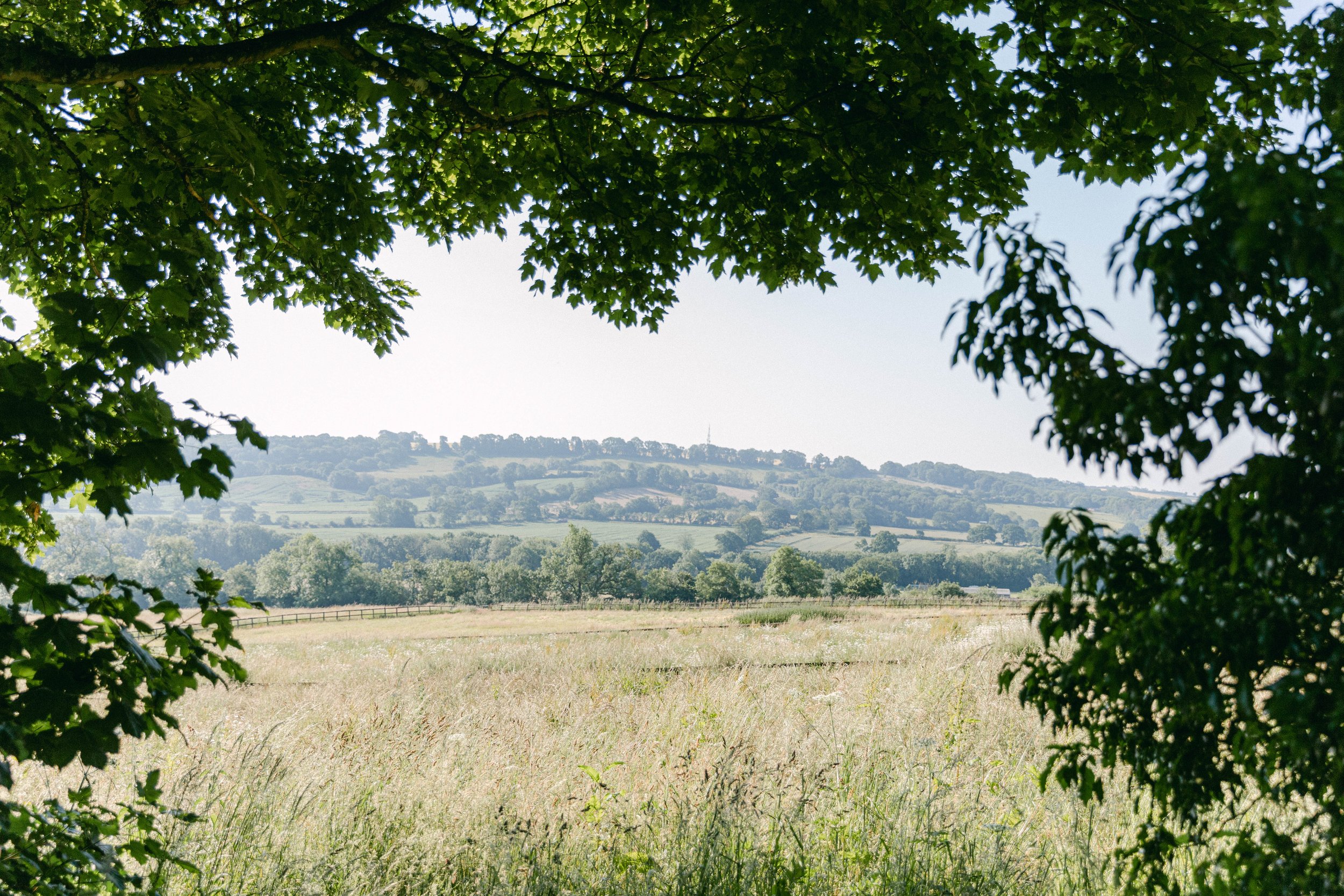
I was drawn to how lush and green this view was, the rolling hills in the distance add a nice visual rhythm, but the image overall feels a bit flat. The grass in the foreground is in shadow, so it recedes rather than adds anything, and there's no strong foreground element to anchor the scene or create depth. It’s pretty, but it lacks that extra layer of dimension or visual tension that would make it truly compelling. Pretty photo, but boring.

I was initially drawn to the lush greenery of this scene, the rolling hills in the distance offer a gentle visual rhythm, but the image ultimately feels a bit flat. The grass in the foreground falls into shadow, so instead of grounding the composition, it fades away. Without a strong foreground element to lead the eye or create contrast, the photo lacks the depth and dimension that I think would improve this photo. It’s undeniably pretty and has a bit of an ethereal vibe, but missing that visual pull and layers.

The way I captured this actually emphasizes just how flat the building is; it really compresses the architecture. Because of the straight-on angle I shot from, everything appears on a single plane, with no visual layers or depth. It ends up feeling very one-note and two-dimensional. It completely compresses the building. This wasn’t the most flattering angle for the structure, as it flattens it even further and doesn’t do the design justice. The best way I found to shoot this house was from at a ¾ angle to create more depth and dimension. When you have flat architecture like this, shooting straight on actually emphasizes that, so if that’s what you intend, then by all means, shoot it straight on. But for me, the most flattering angle for this type of building was from a ¾ angle.
5. Drab, Dull or Unintentional Color Palette
Sometimes a scene just doesn’t offer much color contrast or variety, which can make the image feel a bit visually dull. If there’s little color contrast or very little color at all, that can contribute to a flat feeling. But again, that’s not always a bad thing. A neutral or analogous color palette can be incredibly beautiful when used with intention. It comes down to the mood and story you're trying to tell. If a photo feels a bit lifeless, consider whether a lack of color, or color that appears muted due to flat lighting might be part of the reason. The key with all of these tips is to remember that there’s rarely a hard yes or no. Photography lives in the gray area, and every image is different. What feels flat in one context might feel quiet and intentional in another. So if your photo feels flat, notice the colors in the frame and how they interact with each other. Does it feel harmonious, complementary? I find that how we receive and perceive color is very much connected to how it interacts with the available light.
Next time: Pay attention to how color shows up in different light, and how it intensifies or interacts with light. Observe the colors in your frame and bear in mind the visual weight of each color. Brighter objects take up more of our visual attention, while darker colors or shadows take less of our attention. Our eyes are naturally drawn to highlights and bright colors of an image first, often before noticing what’s happening in the shadows or darker tones. Slightly underexposing in camera can also add richness and depth to color if the light is a bit flat.

This was such a serene moment in Florence, but something about the image doesn’t quite land for me. The light was heavily diffused, which left the colors feeling muted and a bit dull. Even the highlights on the water fall flat, lacking the sparkle or contrast that might have brought the scene to life. Visually, it just feels a bit bland; pretty, but without that extra spark to make it truly stand out.

This was another scene that left me feeling disappointed in the moment. The light and the vog, just weren’t working in my favor. The haze from Mt. Etna hung heavy in the air, softening everything and washing out the landscape. It had the potential to be a beautiful image, but under these conditions, the scene lost its clarity, depth, and impact. With different light, it could have been breathtaking! Very bummed about this series I took at this spot, but hey it was out of my control.

This charming little scene falls flat for me. The color are drab and the light doesn’t do this village justice. The brown tones are rather dull and deadbeat. Definitely not my preferred color palette.
6. No Clear Subject
Photos often feel flat when it’s unclear what the viewer is meant to focus on. As the photographer, you might know exactly what your subject is in the moment, but to someone else, it might not be so obvious. Without a clear focal point, the eye tends to wander with nowhere to land. Since we take in images in just a fraction of a second, if it’s not immediately clear what the photo is showing or saying, it can leave the viewer feeling disconnected, and the photo feeling visually flat.
Next time: Before taking the shot, ask yourself: What is my subject here? I know that sounds so obvious, like pointless to even say, but it’s true, be very clear on what your subject is or are. Frame it in a way that supports that focus or your story. Use the traditional “rules” or guidelines to help bring focus to your subject, such as negative space, leading lines, or framing. Bear in mind that a clear subject doesn’t mean it has to be a person, an animal, architecture, or something tangible; it can be light, texture, mood, or a single color. But there should be something anchoring the frame so your subject is undeniably obvious.

This scene had so much potential! I loved the narrow street, the texture of the old buildings, and the way the light filtered through the street, it had such a beautiful atmosphere in the moment. But in the photo, something’s missing. Without a clear subject, the image doesn’t quite come to life. I had hoped someone or something might pass through to give it that extra spark, but after waiting about ten minutes, I moved on. As it is, it feels a bit empty and falls short of what it could have been.

Again this image falls flat for me. I wanted to frame up a subject walking through the street with these palm fronds but alas nothing happened. It feels lifeless to me and boring, even though the street is charming.

This was a missed shot for a few reasons. Firstly, by the way I shot it, it looks like I couldn’t make up my mind on what the subject was. The house? The path? The cow parsley? I honestly couldn’t tell you from this shot because it isn’t clear. You sort of get the impression its the house but then there is too much cow parsley covering it and blocking the view. It’s way too busy and cluttered with no clear focal point which is why, I think, it looks flat.
7. Unintentional Aperture Choice
Choosing the “wrong” or less ideal (maybe a better word choice) aperture for the scene can unintentionally make a photo feel flat. Depth of field plays a big role in how we perceive depth and focus. A wide aperture (like f/1.8) can create beautiful background blur, but if overused, it can also blur out too much, leaving your subject feeling disconnected or “floating” in the frame. There can be too much of a good thing! On the other hand, a very narrow aperture (like f/16 or f/22) might bring everything into sharp focus, which can work in landscapes but may flatten a portrait or scene that would benefit from some focus falloff. It’s not the aperture setting itself that causes flatness; it’s how it shapes the viewer’s focus, a sense of depth, and your intention behind the composition. For example, a portrait shot at f/22 may feel flat simply because the background competes too much with the subject. Again, this comes down to your personal style, your artistic choices, and what you’re trying to convey. The right aperture is the one that best supports your subject and helps translate the image you’re trying to create in your style.
Next time: This is quite basic, but use a wide aperture when you want to isolate your subject and create dreamy, bokeh softness. And conversely, use a narrower aperture like f16 when you want more in focus and depth built through layers. Don’t be afraid to experiment in the moment, just notice how aperture changes the feel of your image. If you always shoot landscapes at small apertures, try opening it up wide and see how that looks and feels. You have so much creative control over the look and feel of your photograph simply through aperture.

This shot was almost there, which makes it a little disappointing because the scene itself was so beautiful. I shot this at f/2.8, and in hindsight, I think that was the wrong choice. While I do love the texture of the wildflowers in the foreground, the image ends up feeling too busy without any real definition.
The focus was on the building in the background, but because the depth of field is so shallow, the flowers and trees blur out so much that nothing truly feels sharp, it gives the impression that the whole image is slightly out of focus, even though the left edge of the building is technically sharp.
I think this would have worked much better at f/5.6 to create a bit more depth and preserve more detail in the foreground without losing the softness completely. The flat lighting didn’t help either, it just emphasized the lack of clarity and made the blur feel more like a flaw than a creative choice.

I photographed this foxglove at f/2.8, my love for wide‑open apertures strikes again! Because I was so close, the depth of field became razor‑thin, leaving only the very top of the stem sharp. It’s a classic case of too wide, too close, and a slightly off focal point. Too much of a good thing! Next time, I’d stay at the same distance but stop down a one or two stops; that would keep more of the bloom crisp while still giving me plenty of dreamy bokeh.
Another landscape shot at f/2.8, are we noticing a pattern here? I genuinely love shooting wide open because of the creamy, dreamlike quality it creates. But in this case, it just doesn’t work. The image falls flat because it lacks depth and definition, and the soft, even lighting makes it feel even more washed out.
The focal point is also off; there’s no clear area of sharpness to anchor the eye. Ideally, I should’ve focused on the first line of trees in the distance, but as it is, the image lacks intention.
That said, I’m not suggesting you shouldn’t shoot landscapes at a wide aperture (I do often!), but doing so means you need to be extra mindful of where you’re placing focus, what your subject actually is, and what feeling you’re trying to evoke. Otherwise, all that dreamy depth of field just ends up diluting the impact.
8. Flat Mood or Emotion
This one’s more subtle, but important. Sometimes a photo feels flat, not because of technical reasons, but because there was no real energy in the moment, or the ambiance or emotional tone falls short. And this doesn’t just pertain to people, it can be a landscape, anything in nature, architecture, anything. This goes hand in hand with light because light adds so much emotional weight and tone to our composition. You might completely disagree with me on this, and I understand, but for me, if there isn’t some spirit, feeling, or sensibility in an image, it tends to fall flat. Even in something as simple as the quiet beauty of a single rose or a portrait of a bird peeking through leaves, I’m drawn to a sense of presence, mood, or emotion. I think part of that comes from wanting there to be a story or even a subtle question beneath the surface of the photograph. Of course, this is a deeply personal perspective and may not resonate with your style, and that’s completely okay.
Next time: This one’s hard to put into words, but it’s worth addressing. Before you rush to snap the shot, take a moment to feel the scene. Tune into the energy, the emotion, and what you want to express through your composition. Maybe it’s not quite there yet. Maybe the light needs to shift, or the mood just hasn’t settled. This is about presence and about being fully aware of your subject and surroundings, and letting your emotions guide how you see.
It takes a bit of patience. I think as photographers, we inherently have to be patient people! Sometimes the energy just needs a moment to soften, or a cloud needs to pass for the sun to break through, and suddenly, everything changes. We’ve all looked at a beautiful view, rolling hills, a sweeping landscape, and felt a strange disconnect. It's a gorgeous or interesting scene, but somehow, it falls flat. But then the light shifts, and the emotional tone transforms entirely. Light and emotion are deeply intertwined. Light, in all its hues and intensities, deeply influences our psyche and shapes how we perceive the energy or emotion of our subject. When a scene or composition feels flat, I find it helps to just take a beat and pause for a moment. Maybe something shifts, or maybe that pause allows me to think, recompose, and see things differently. I ask myself, “What is making this feel flat?” Sometimes the light will change, the mood will soften, or something subtle will reveal itself. Other times, it’s up to us to take creative control if that shift doesn’t naturally happen. Try moving your feet, changing your angle, adjusting your aperture or shutter speed, creating layers, or reframing the composition. If an image feels flat because of the light or lack of emotion, visual interest, or any number of factors, we have to work just that bit harder to bring it to life, so to speak. I’ve found that if the light isn’t cooperating with the mood I want to convey, I just roll with it and go with the flow. I lean into what energy or atmosphere is present. I try my best to embrace the light and energy of the scene for what it is and make the most of it.

I was really drawn to the tones in this shot—the soft blues and warm oranges play so beautifully together as complementary colors. But as you can see, no one is particularly engaged with the camera or interacting within the frame, so the image feels a bit flat emotionally. Even the slightest shift in body language or a hint of expression would have brought much more life and mood to the scene. Just a small change could have made a big difference.

Alas, another missed opportunity! I was drawn to the colors and textures, the contrast between the wood and the curtains, and the layered reflections in the window. I love the tones and even the waiter’s pose, but because his face is hidden and the rest of the figures in the reflection are blurred, the image ends up feeling flat.
There’s a quiet intrigue, as if I’m peering into a scene from the outside, but without a clear emotional anchor, like a visible gesture or expression, it doesn’t quite land. When shooting into reflections like this, the emotion or interaction becomes even more important to help translate the story. Otherwise, it risks becoming just a visual wash of colors and shapes, without any connection or even visual interest for that matter. What this photo really needed was a little more patience on my part to wait for a moment with a stronger emotional tone to naturally unfold! A simple gesture, a glance, a clearer picture of someone inside…anything!