Why These Photos Work
Many of you have asked how to tell if a photo works. To be honest, it’s a tough question to answer definitively. That’s because every image exists within its own unique context: the light, the subject, the moment, the intent behind the frame. And perhaps most importantly, photography is deeply subjective. What makes a “good” photo can vary widely from one person to the next.
Sure, there are foundational principles, like the rule of thirds, balance, leading lines, and the power of odds, that can guide composition. And yes, technical sharpness and exposure can play a role. But even when an image checks all the “right” boxes, it might not land emotionally or visually for everyone. On the flip side, a blurry, rule-breaking frame might resonate deeply and linger in someone’s memory.
In this post, I’m sharing a few of my own photographs and explaining why they work for me. You might see them differently—and that’s okay. In fact, that’s the whole point. What connects us to a photo is often personal: the story it tells, the feeling it evokes, the way it aligns (or doesn’t) with our own aesthetic sensibilities and photographic eye.
My hope is that by walking you through a few examples, you’ll not only see how I approach composition and light, but also begin to notice what you respond to in an image. Maybe you’ll start to articulate your own style more clearly, or feel permission to break some rules in pursuit of something that feels truer to you.
Because ultimately, a “good” photo isn’t about perfection, it’s about perception and personal style. And that is different for all of us.

While the subject is simple, this photo works for several reasons. First, the color contrast, soft lighting, and the placement of the lamp along the rule of thirds all contribute to its strength. The dramatic shadow cast by the lamp adds visual interest and depth. The colors are analogous, creating a cohesive and harmonious palette. It’s a strong example of an atmospheric image; minimal in subject but elevated by thoughtful composition and tonal balance.

This was a product shoot for a winery, and while it’s not my usual style, the focus was clearly on the rosé bottle as the hero of the scene. The panna cotta and other dishes played supporting roles, helping to tell the story around the wine. The composition makes it immediately clear what the primary subject is. Even though the light was a bit harsh, the overall palette, strawberry tones paired with soft blues, evokes a summery, fresh feeling that ties everything together visually. I intentionally photographed this in dappled midday light to capture a sense of relaxed, summery ease and evoke that idyllic, sun-soaked atmosphere.

This photo works for me for a few key reasons. First, it has distinct visual layers: the fence in the foreground, the palm leaves echoing the fence’s lines, and the beach view beyond. These three layers add depth and structure to the frame. I also intentionally bent down to shoot from a lower angle, creating the feeling of peering down onto the beach, which adds both perspective and a stronger sense of dimension. To me, framing the beach this way is far more interesting than had I shot from the railing down below.

This is a clean, minimal image that draws its strength from simplicity and scale. I was especially drawn to the layered shades of blue and the dramatic coastline of South Africa. To maintain that sense of clarity, I intentionally eliminated distractions, trees, and shrubs that cluttered the frame where I stood by carefully adjusting my position. What makes this photo work for me is the contrast between the vast, grand scale of the mountains and ocean, and the minimalist composition and limited color palette. It feels both expansive and restrained. I also chose to place the horizon along the center plane to emphasize balance and calm.

This was a charming moment I captured while wandering through Stow-on-the-Wold, and the image resonates with me for several reasons. The man himself was such a character—from his hat and baggy pants to the “Stop me and buy one” sign and the umbrella, every detail felt endearing and expressive of his personality. The pops of red, blue, and white stand out vividly against the muted background, drawing the eye in. To me, it reads as a candid portrait that captures the spirit of the moment and what he’s offering in a warm, genuine way. I also love that he’s not looking at the camera, it makes the photo feel more authentic and unposed.

This quiet scene resonates with me for several reasons. It was taken just after a winter snowstorm, when everything felt hushed, the snow muffling every sound. I wanted to capture that stillness, which is why I intentionally left a large portion of the frame as negative space on the left. That emptiness emphasizes the quiet and calm that snow brings. The pop of red contrasts sharply against the white landscape and is placed along the rule of thirds, making it feel visually grounded and balanced. This image is a strong example of how negative space can enhance your subject. I think zooming in or cropping would have diminished the sense of stillness and impact.

These four immediately caught my eye, and the composition struck me right away. The diagonal line of the rocks cuts across the frame in a way that’s visually compelling—I'm always drawn to strong lines, whether natural or manmade. Here, the rocks act as leading lines, guiding the viewer’s gaze straight to the four older men, casually soaking up the sun. It felt so quintessentially Italian—a spontaneous summer scene capturing the relaxed spirit of beach life and its devoted sun worshippers. I also intentionally left negative space around them to emphasize their presence and give the moment room to breathe. My subjects are clear and unmistakable—which might seem simple, but it’s surprisingly easy for a subject to get lost amidst the surrounding scene, atmosphere, and extra elements in a frame.
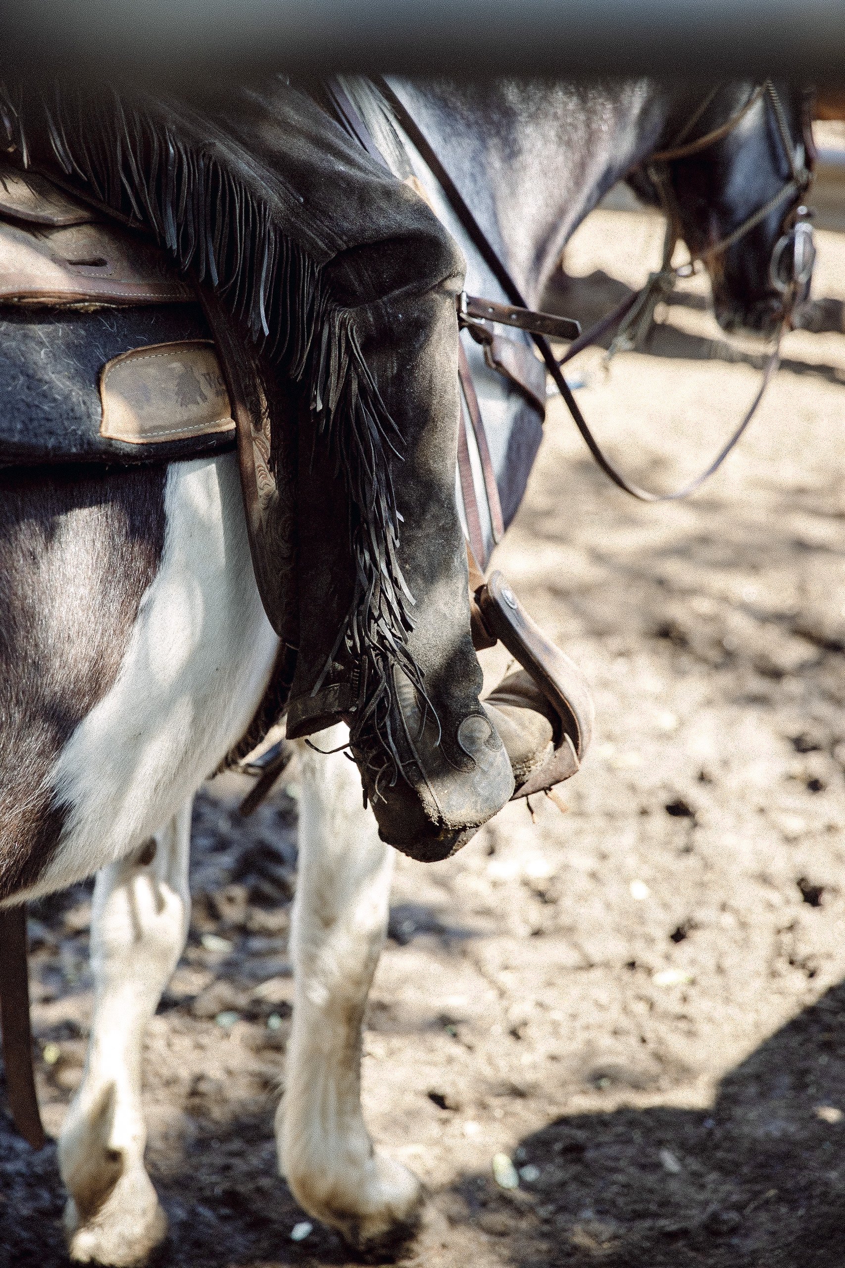
This image feels visually striking to me because it leans deeper into storytelling through detail rather than the whole subject. In the moment, I was drawn to the boots, spurs, and stirrups—elements that speak volumes about the paniolo (Hawaiian cowboy) without needing to show him entirely. Framing the shot through the fence helps spotlight the boot, while the chaps and boots hint at the larger story. I intentionally used a wide aperture to isolate these details and keep the focus exactly where I wanted it. There’s also a subtle visual rhythm—the rider’s boot aligns with the horse’s leg and hoof, creating a mirrored line. The muted, cohesive color palette ties it all together without letting any one tone overpower the scene.

This was a quick snap I caught through the window of a pasticceria. What works for me is its simplicity and clarity, yet there’s a subtle layering—if you look closely, you can see it was shot through glass, with a smoky reflection softening the left side of the frame. I used a wide aperture at f/2.8 to focus on the details of the pasta, letting the foreground elements add depth and texture. I love how the pasta almost feels like it’s being presented to the camera, even though it was just a fleeting moment. There’s just enough context to understand the setting, but nothing that distracts from the main subject: that beautifully plated dish.

This golden image taken in Florence resonates with me on several levels. The strongest element is the use of leading lines—the street stretching toward the horizon, the row of people, the lanterns, and even the distant bridge, all converging toward a single focal point where the sun meets the horizon. The rich golden tones are visually striking, and while the shadows are deep, there's still just enough detail to make out the figures and the warm light reflecting off the buildings. What really anchors the photo is the sense of movement and direction, all the lines pulling your eye toward that glowing vanishing point in the distance where the sun is setting.

This was a beautiful spring day in the English countryside, and while the stately home was originally my main subject, I noticed the delicate buttercups scattered across the lawn. The house, when photographed straight on, felt a bit flat, so I decided to shift perspective. By getting low to the ground and focusing on the buttercups, I was able to add a soft, colorful foreground that speaks to the season and adds a sense of depth. Even though the house is out of focus, you still understand the setting, and the blurred background allows the flowers to take center stage. I shot this wide open at f/2.8, which helped isolate the flowers while still hinting at the grandeur behind them. Changing your angle and using your surroundings, like wildflowers or texture, can breathe new life into subjects that might otherwise feel too expected or traditional.

This enchanting scene works on a few levels for me. Firstly, the framing of the leaves gently encircles the pathway through the wild garlic, beautifully guiding your eyes along the trail. The dappled light adds a soft, magical quality that enhances the sense of mystery and wonder, inviting you to imagine where the path might lead. The leaves in the foreground create an additional visual layer, adding depth and interest to the composition.

This was a very voggy day, and the colors in the scene felt quite muted. To make the image more visually engaging, I bent down and shot through an ornate railing, using it as a frame within the frame. This added a sense of depth and created a picture inside a picture, making the composition much more dynamic. By simply shifting my perspective, I found a more intriguing angle that brought visual interest and dimension to an otherwise flat, subdued scene.

While this image doesn’t have a traditional focal point like a church or a person, it still works for me for several reasons. It’s more of a detail shot that provides context and a sense of place. The flags are both symbolic and visually striking, arranged in a zigzag pattern that naturally guides the viewer’s eye across the frame, echoing the way they flutter in the breeze. I intentionally kept the church out of focus to highlight the shape and movement of the flags. These angles caught my attention when I was framing up my shot. For me, eye movement is key in composition—considering how the viewer’s gaze flows from the main subject to the supporting elements is what brings the image to life.

This is a visually poignant image that works for me on several levels. First and foremost, the direction of light is key. I often prefer to shoot into the light or have it coming from a 45 or 90-degree angle—and in this case, the side lighting at 90 degrees beautifully illuminates the action. It highlights the dusting of flour, the hands, and the dome of dough in a way that feels both natural and intentional, while still preserving detail in the shadows. The chiaroscuro effect adds a dramatic quality, creating depth and dimension. That soft, directional light not only defines the subject but also emphasizes the gesture and movement within the frame.

Once again, it’s the leading lines that make this image work for me. The rooftops naturally guide the viewer’s eye straight to the basilica, drawing attention to it even amidst the surrounding buildings and visual noise. I chose to edit this in black and white because it strips away the distraction of color and allows the shapes, lines, and overall composition to take center stage. The shadows on the rooftops become more pronounced, and the geometry of the scene feels stronger and more intentional. All the lines converge at a vanishing point that lands at the base of the basilica, creating a quiet but powerful focal point. Black and white enhances this sense of structure and clarity, which is what I wanted to highlight in this frame.
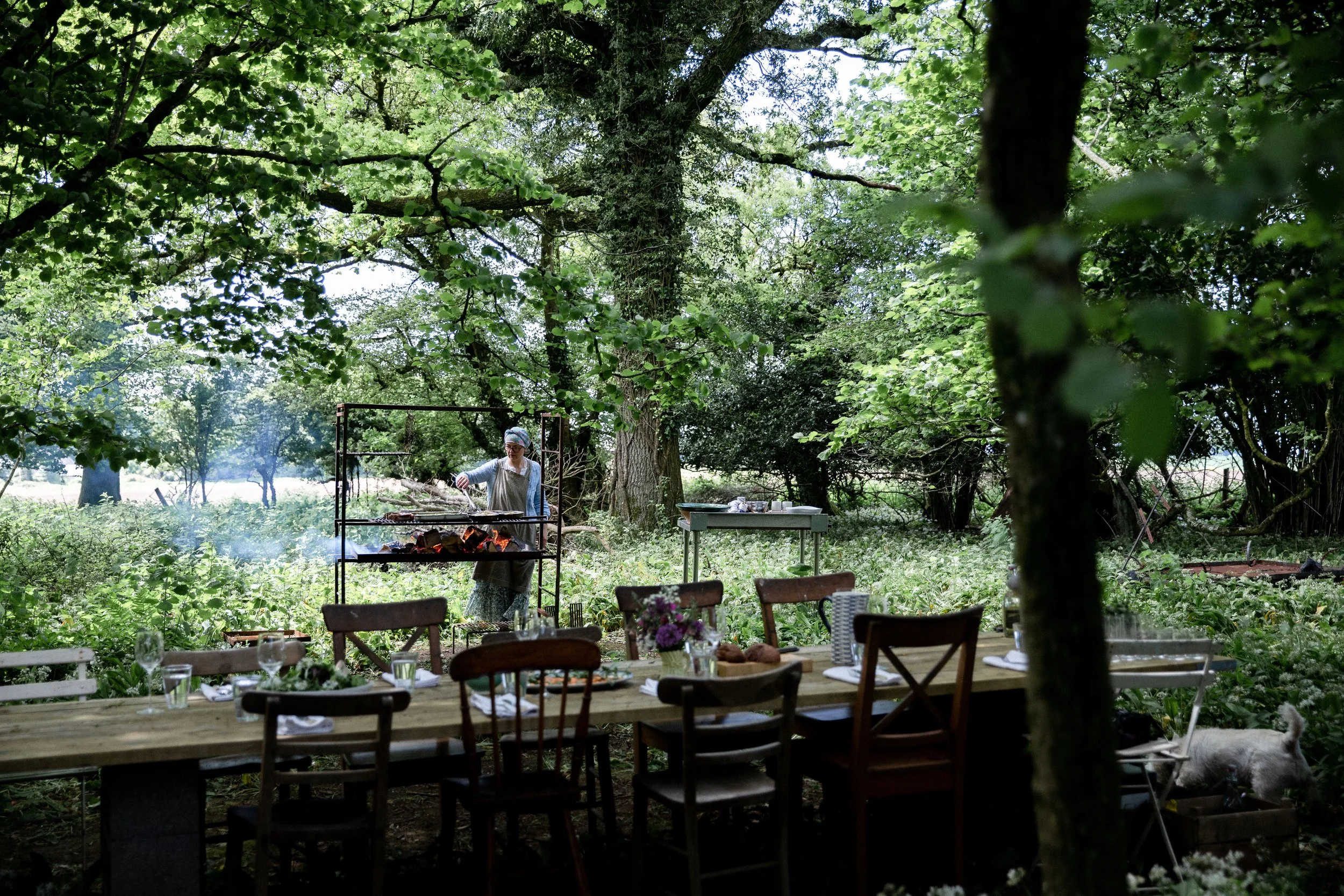
What makes this photo work for me most is the framing and the way the light pours in behind the woman cooking at the grill. She’s completely in her own world, absorbed in the moment, which adds an intimate, candid feel. While the table and surrounding elements provide context, they don’t distract from her presence—they support the story without overpowering it. The tree on the far third of the frame helps to subtly contain and guide the viewer’s eye toward her. While I might have preferred the scene without the tree, I chose to work with it, placing it along the third line to help anchor the composition and direct focus.

While it may seem like not much is happening in this image, it’s the shadow and negative space that make it strong in my opinion. That quiet, empty area isn’t just blank, it’s doing the visual heavy lifting by emphasizing and supporting the subject. The negative space takes up about a third of the frame, creating balance with the other two-thirds where the jam and pastry sit. I love how the light pours in from the window at a 90-degree angle, casting beautiful highlights and allowing the rest of the table to gently fall into shadow. That side light creates depth and dimension, while the use of negative space gives the image breathing room and balance. It helps guide the viewer’s attention and gives the subject, the hand pies, space to stand out without distraction.

This image is a bit of a departure from my usual style, but it captures exactly what I intended. I wanted to convey the motion, speed, and energy of the polo match, so I chose to shoot with a slower shutter speed to emphasize movement. For me, a powerful photo doesn’t always have to be tack-sharp; it’s about the feeling and the story you’re telling. The intentional blur gives the image a sense of fluidity and momentum, while still holding the strength and intensity of the moment. It’s dynamic, expressive, and captures the essence of the action in a way that a frozen frame wouldn’t.

There are a few elements that make this image work for me. The dappled, natural lighting captures the lighthearted energy of the scene, and the fig cake remains the clear focal point. The geranium helps frame the cake beautifully, it draws your eye toward it without competing for attention. While there are hints of other details in the background, like teacups and plates, they stay softly blurred, allowing the cake to take center stage. Even though the table is full, the composition feels visually balanced. The geranium also fills what would have been an empty, less engaging space with a fresh touch of green, adding both color and structure to the overall frame.

I was drawn to the wintry golden glow of this scene at home in Vermont. What I love most about this photo is how it captures both the warmth of the low winter sun and the crispness of the cold air. I shot this at f/22 intentionally to create sun stars, which emphasize that glowing light and give the image a sense of radiance. I also bent down to shoot through the fence, using it as a natural frame for the three horses gathered in the pasture. They're softly backlit, which adds depth and mood. I often aim to include odd numbers of subjects in a frame when I can, though it's not a rule. Generally speaking, odd numbers feel more balanced and visually pleasing.

This is a simple scene featuring spring produce, but what makes it work for me is the lighting and color palette. The light has a chiaroscuro quality, illuminating the fruits and vegetables in a way that draws your eye to their texture and color before gently fading into shadow. The soft pinks and greens complement each other beautifully, and the angled arrangement creates a subtle sense of movement, making the composition more dynamic than if they were positioned in a straight line.