What A Restaurant Table Can Teach You About Food Photography Styling
Styling in food photography ranges on a broad creative spectrum. On one end, it can be minimalistic and clean to overly styled, erring on the verge of contrived. I think the right balance is somewhere in the middle, where it feels and looks believable but intentional. A slice of life, if you will. When I first started shooting food photography for clients, my styling was all over the place. Finding my stride and developing my eye to know what looked right took me a while. It boils down to practicing in various scenes, using different elements, props, lighting, and backgrounds. As always, it begins with telling a story. A story that makes you want to dig right in, brings back memories, entices, or whatever you want to tell. Without a story, it falls flat. No matter how incredible the dish is or how beautifully the cake is presented, if there isn't context or an underlying story, even if it's as basic as a delicious cake that was just baked with fresh apples picked from the backyard orchard, it lacks substance and depth.
But if there is one framework or theory I could distill down to teach someone how to style food, it would be this: style it as someone was just eating, preparing, prepping, slicing, enjoying the dish or scene, and then just walked away from the table or area. I was at a coffee shop this morning, and they were turning over for lunch, and I thought a restaurant is the perfect example for this. Think of a restaurant, any restaurant. You wait for your table, look around, take in the ambiance, the buzz, check out people's orders and what's on the menu. The hostess comes and says your table is ready. As you make your way over to the table, you walk past people enjoying their meal. Maybe some have finished and left, only empty dishes remain, and perhaps some are just nibbling on bread or appetizers. Or maybe some are lingering over a bottle of wine with some olives. You sit down, and your neighbor's food arrives at the table; the patrons are hungry and ready to tuck into the steaming bowl of bolognese.
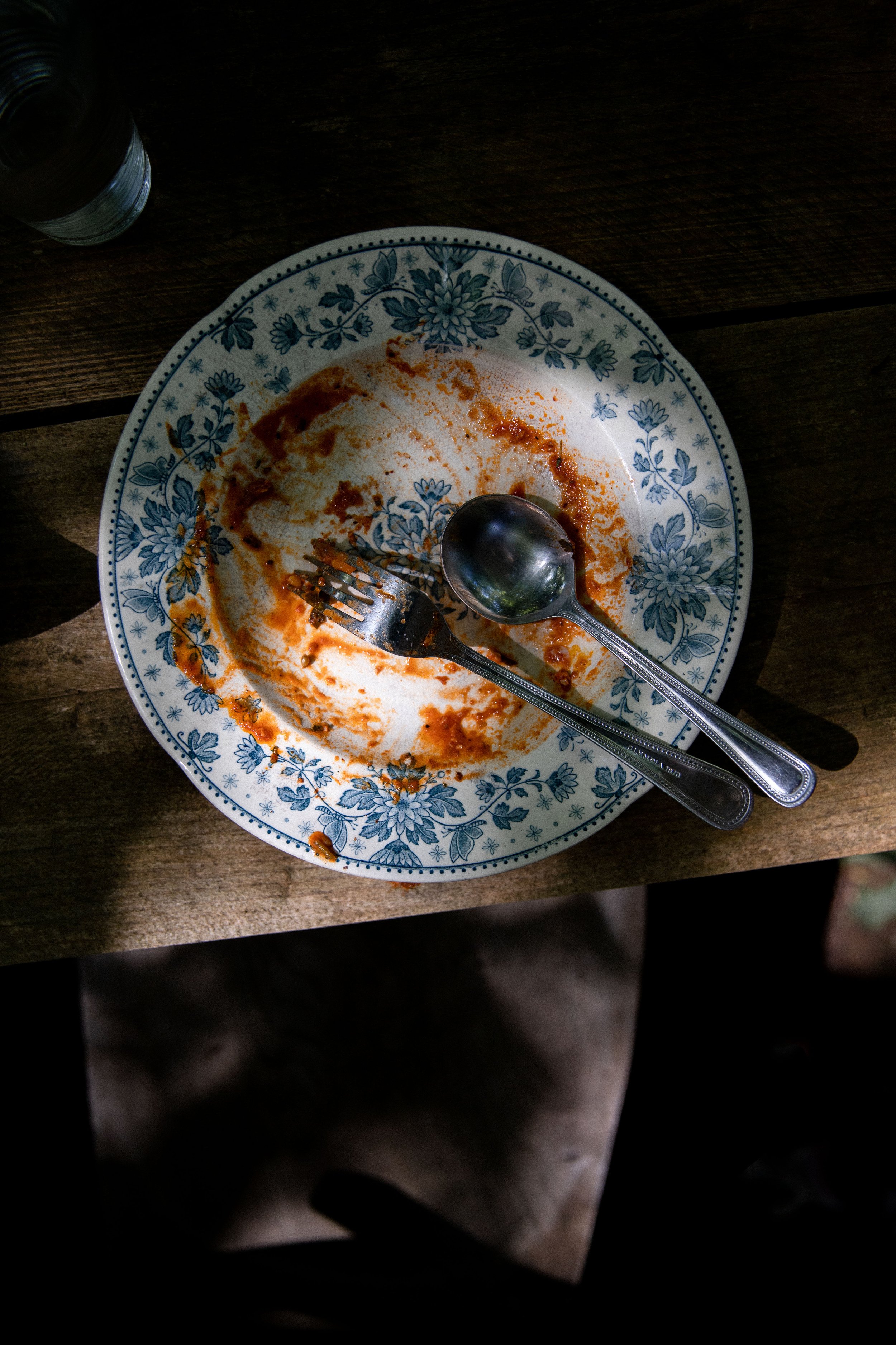
So now you see the restaurant in your mind, imagine you could flip a switch, and everyone at the tables would disappear. What do you see? A few droplets of spilled red wine on the white tablecloth? Bread crumbs sprinkled around the dinner plate? A half-twirled forkful of pasta lying on the side of the plate? A green salad half eaten? A bite missing out of a piece of a margarita pizza next to some pizza crust? These may not be composed in the most visually appealing way on the table, but behind your camera lens, they convey something more. They authentically convey life, something lived in, enjoyed, savored, a moment…The nearly licked-clean bowl of bolognese tells just as much of a story as a whole steaming bowl straight from the kitchen. The after mess on the table after a thoroughly enjoyed meal tells a story, even if only a few bits and spoonfuls of the meal are left. An empty espresso cup with milky foam rings around the interior equally tells a story like a freshly brewed cappuccino does.
Now, if we zoom out, how can this restaurant scene guide you on how you shoot and style your own work? Style the scene as if someone just walked away or went to the restroom mid-meal or even closer to the end of the meal. Or if you are styling ingredients or a prep scene, style it as if someone just walked away to the pantry with the flour dusted over the table, the butter cut into cubes, and the apple peels in a pile on the side. It becomes contrived when it looks too perfect, too meticulous, too "just so." When you think you've "got the shot," keep playing with it and letting the scene live and breathe like the tables at the restaurant. Again, it all comes down to personal preference, but using this framework as a guide makes my work look and feel more natural. I'm not too precious about it. I'll take a few shots of the cake uncut but then get right in there and slice it up, mess it about, drizzle on the sauce, take a few bites, and spread a few crumbs. I think imperfection is far more interesting, but that's just my approach.
Don't hesitate to reach out if you'd like more guidance on styling and defining your aesthetic. These things are so much fun to discuss and play with, and I'd love to hear from you.
x


